About Our Weather

At Fish Ranger we believe in providing the best weather information available. We only use high resolution forecast grids from the Australian Bureau of Meteorology and process them to the highest standards to ensure you get the most accurate, up to date and location specific weather information possible.

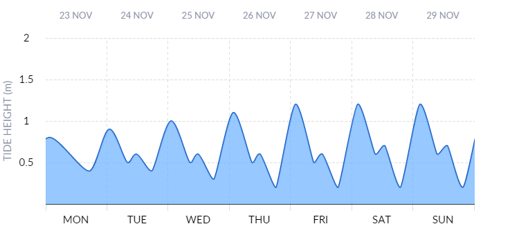
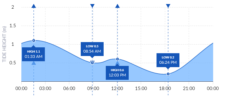
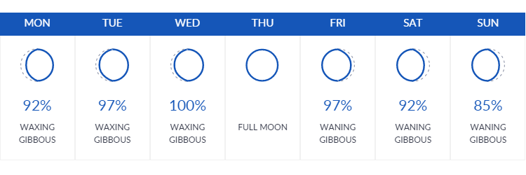
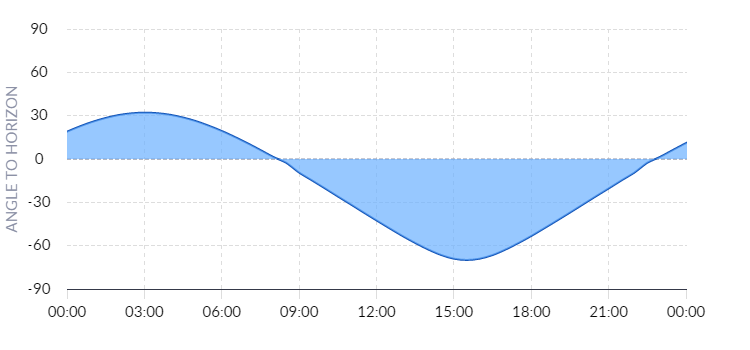
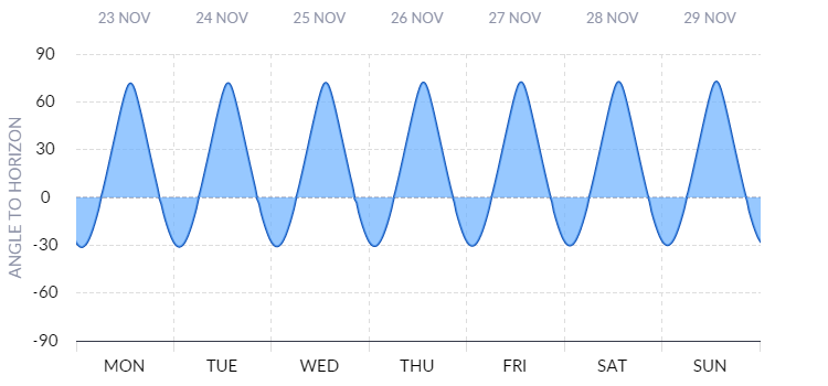
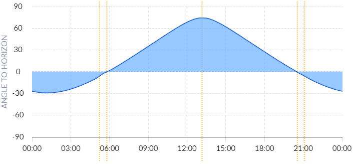
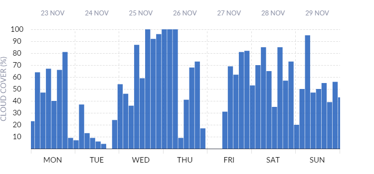
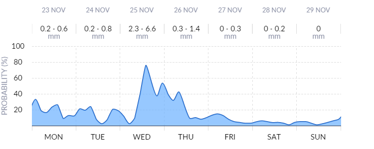
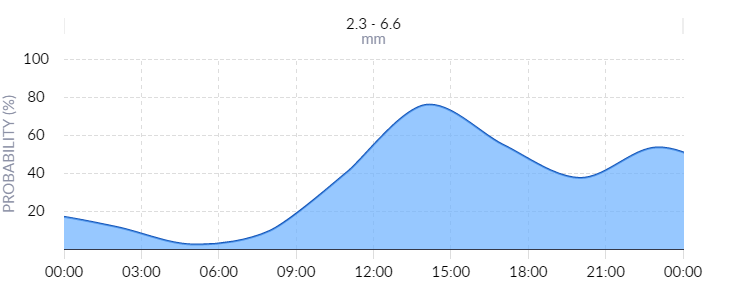
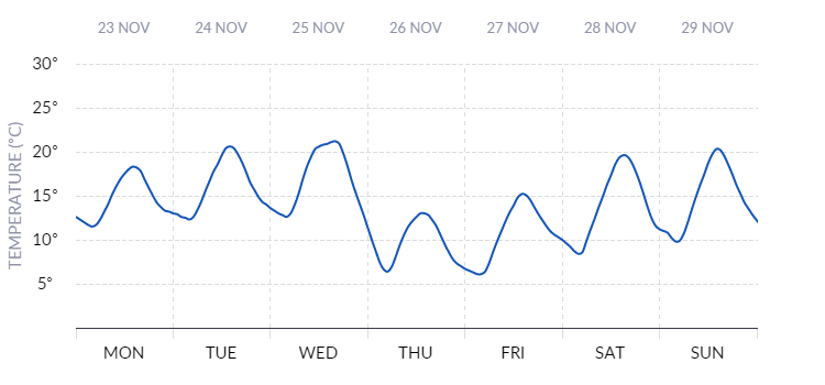
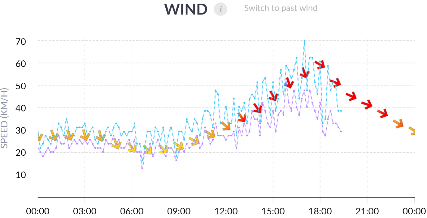
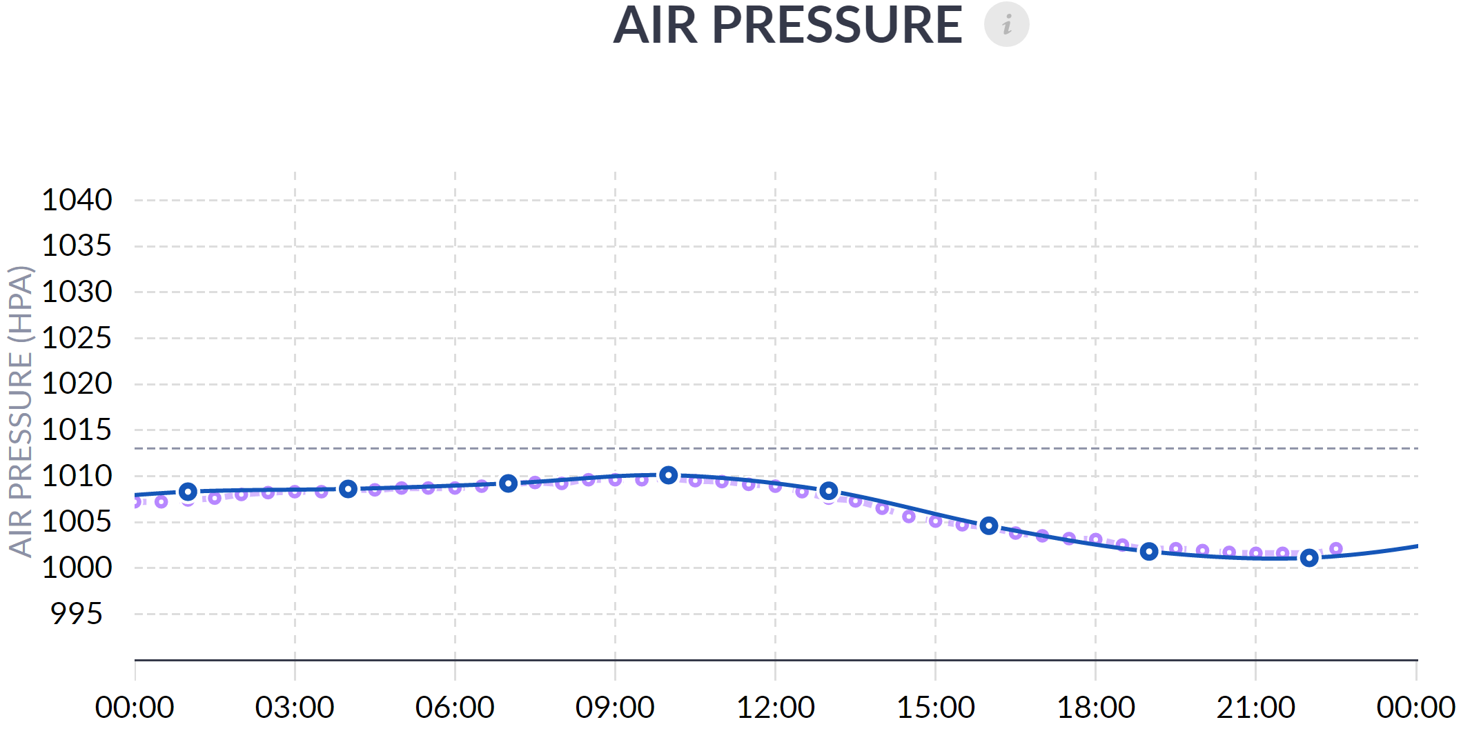
Forecast Weather, Current Weather and Past Weather pages are displayed for each registered location. The Forecast weather page shows forecasts and sun, moon and tide predictions occurring in future. The Current Weather page shows information relevant to the present day including real time measurements of temperature, humidity, rain, wind, air pressure, water temperature, radar images, satellite images, maximum UV index and weather warnings issued for the state. The past weather page shows weather elements observed at or near the location and predictions of sun, moon and tides occurring in the past.

To see where all ground based weather stations are located throughout Australia you can check out our Weather Observation Station page.

Our Weather Charts

Fish Ranger uses three forecast models to generate its charts.

ADFD - This is the premium forecast model from the Australian Bureau of Meteorology. After high resolution forecasts are produced by super computers, experienced meteorologists then manually adjust the models for each state based on knowledge of local weather systems. The ADFD has a resolution of 3km in VIC and TAS and 6km in other states. These models offer the highest forecast resolution available anywhere in the world for Australia and together with the manual vetting, offer superior performance to international models such as GFS. The ADFD model is used to produce the following charts: Wind, Wind Wave, Primary Swell, Secondary Swell, Total Wave (ADFD), Temperature & Rain.

ACCESS - This model is produced by the Bureau of Meteorology and is used to generate Air Pressure and Cloud Cover charts. This model has a resolution of 11km out to 3 days and 40km resolution from days 3 to 7.

AUSWAVE - This model is produced by the Bureau of Meteorology and is used to generate the Total Wave (Auswave) chart. This model has a resolution of 10km out to 3 days and 40km resolution from days 3 to 7.

Our Weather Charts

Our weather charts can be viewed in 7 day view to provide a look at the week ahead or 1 day view to provide a detailed look at any single day.

You can select which charts you want to see and the display order by going to

My Account -> Account Settings -> Display Settings

Wind

Wind
Wind

Our Wind chart shows both speed and direction of wind. Arrows show the direction wind is blowing and the height of arrow shows wind strength. As an added visual guide, calm winds are represented in green and as wind gets stronger arrows change colour to yellow then red. When the wind chart is viewed with header map active, the arrows make it easy to visualise the direction of wind in relation to the location.

Wind Wave

Wind Wave

Wind waves are waves caused by wind blowing across the water surface. Our Wind Wave chart shows the forecast height of waves caused by wind at the selected location. Given wind waves are caused by wind, the direction of these waves is identical to wind direction. Low waves correspond to calm conditions and are shown in green. As wave height increases and conditions become choppier colour changes to yellow then red. The high resolution forecast grids we use for Wind Wave are available for a 4 day period. For this reason Wind Wave charts are shown for the present day and 4 days ahead from present

Forecast Wind Wave charts are provided for all 'Ocean & Sea', Surf & Rock and most 'Bay & Estuary' location types. Observed wind wave charts are not available.

Primary Swell & Secondary Swell

Primary Swell
Secondary Swell

Swell is an after effect from far away weather systems that can travel across the ocean surface for hundreds or even thousands of kilometres. Just like throwing a stone into a lake causes ripples that travel many meters away from the point of impact, so too can a faraway storm cause swell that emanates away from the storm center. In addition, just like you can throw two stones into a lake in different places, you can have two storms in different places that each generate their own swell fronts, these swell fronts can therefor approach a coastline from different directions and at different magnitudes. There could in fact be many storms and many storm fronts but in practice there is usually only one or two. The strongest of these swell fronts is called the Primary Swell and the weaker front is called the Secondary Swell. The Primary Swell chart shows the height of the primary swell and the blue arrows at the top show the direction the swell front is travelling. Similarly, the Secondary Swell chart shows the height and direction of the secondary swell front. Although the swell front can last for days, over the course of time it will diminish in magnitude until it ceases to exist.

It is important to note there may be times where the secondary swell is greater in magnitude than the primary swell simply because the primary swell has died down in strength and the after effects from the secondary swell happen to be stronger than the primary. It comes down to the point at which the primary swell gets reclassified into a secondary swell and vice versa. This is why at times you may notice a discrepancy between the text forecast stating values for Swell 1 (aka Primary) and Swell 2 (aka Secondary) yet the forecast charts show them the other way around. The height of the solid area of the chart shows the height of the swell wave. At the top of the chart are blue arrows, these show the direction the swell is travelling. Note that Primary and Secondary swell charts do not show wave period (See Total Wave – Auswave for period). The high resolution model which provides swell data extends to 4 days ahead from the present time.

Forecast Primary and Secondary Swell charts are provided for all ‘Ocean & Sea’, ‘Surf & Rock’ and some ‘Bay & Estuary’ location types.

Total Wave

Total wave provides a convenient way to see the summation of effects caused by all wind wave, primary swell and secondary swell components in a single chart. We have two variants of the Total Wave chart – one derived from the ADFD forecast model and the other from the AUSWAVE forecast model. The AUSWAVE model extends to 7 days, includes wave period and has a resolution of 10km. The ADFD model extends to 4 days and has a resolution of 3km or 6km (state dependant) but does not show wave direction or period. Although the Total Wave (AUSWAVE) chart doesn’t have the same super high resolution as the Total Wave (ADFD) chart, given it extends to 7 days and provides wave period information we choose to show this to assist with trip planning. Users should note they may at times notice inconsistency between this chart and the Wind Wave, Primary Swell and Secondary Swell charts since they are derived from a different model. These inconsistencies are usually in the form of a time shifted peak in wave height or a difference in magnitude compared to corresponding peaks in the Wind, Primary Swell and Secondary Swell charts.

Total Wave (ADFD)

Total Wave (ADFD)s

The Total Wave (ADFD) chart tells us total wave height. Low values represent small waves and calm conditions, high values represent large waves and rough conditions. As wave height increases colour changes from green to yellow then red.

Given its high resolution, the ADFD model works well close in to shore as well as far out at sea. Depending on the location we may show the Total Wave ADFD chart in conjunction with the AUSWAVE version, in isolation or not at all.

Total Wave (Auswave)

Total Wave

The Total Wave (Auswave) chart tells us three things; mean wave height, mean wave period and mean wave direction. The solid chart area shows wave height; low values represent small waves and calm conditions, high values represent large waves and rough conditions. As wave height increases colour changes from green to yellow then red.

The blue arrows show mean wave period and mean wave direction. The direction of arrow represents the direction of wave and the arrow height represents wave period. A long period means wave crests are coming in slow succession and a low period means wave crests are coming in fast succession. The left axis of the chart is used to read swell height and the right axis used to read swell period. The AUSWAVE model performs best in open water. For some coastal locations, especially around land formations that obstruct waves, we may not show this chart and will instead show the Total Wave ADFD chart.

Air Pressure

Air Pressure

Our air pressure chart is specifically designed for fishermen. It shows air pressure for the selected location and includes a reference line centred on Mean Sea Level Pressure (MSLP) of 1013hPa. If values lie above the reference line it represents higher air pressure and if values lie below the reference line it represents lower air pressure. This chart provides a view to changes in weather patterns such as approaching warm or cold fronts. When combined with knowledge on target species this chart provides a good indication of fishing effectiveness.

Forecast air pressure is provided for all registered locations and observed air pressure is provided for most registered locations

Tides

Tide
Tide

Our Tides chart shows tide times and tide heights for registered locations that experience tides. In 1 day view times for high and low tide and respective heights at those times are marked. Select ‘Show High & Low Tide Times’ at the top of the charts in 1 day view to display vertical lines across all charts showing times at which high (up arrow) or low (down arrows) tides occur.

Moon Phase and Moon Elevation

Moon Phase
Moon Elevation

In 7 day view we show moon phase and the percentage of moon. There are other sources to learn about moon phases in greater detail but the four key words to remember are: crescent, gibbous, waning and waxing. Crescent refers to phases where the moon is less than half illuminated and gibbous refers to phases where the moon is more than half illuminated. Waxing means "growing" or expanding in illumination and waning means "shrinking" or decreasing in illumination. So a waxing gibbous moon is one that is greater than half and increasing in size whereas a waning crescent is one where the moon is less than half and decreasing in size.

In 1 day view we show the elevation of moon relative to the horizon. The times where the moon is at 0 degrees to the horizon are times when the moon rises and sets. Upper transit is when the moon reaches its highest point in the sky and lower transit is when the moon is at its furthest point away underfoot.

We calculate moon times individually for each location so you can be confident our predictions are accurate.

Moon charts can be found on all forecast and observed weather pages.

Sun Elevation

Sun Elevation
Sun Elevation

Our sun elevation chart shows the angle of sun relative to the horizon. At sunrise and sunset the sun is parallel with the horizon at 0° and at solar noon the sun is at its zenith. Depending on location latitude and time of year the maximum angle the sun reaches at noon will differ. For first light and last light we use civil dawn and civil dusk which are defined as when the sun is exactly 6° degrees below the horizon (-6°). These points correspond to times when the need for artificial light for outdoor activities ceases or commences. We calculate sun times for each individual location so you can be confident our predictions are accurate. When in 1 day view times for first light, sunrise, solar noon, sunset and last light are indicated. If ‘Show Sun Times’ is selected at the top of the charts in 1 day view those key sun times will be displayed on all charts in the form of vertical yellow lines. Sun charts can be found on all forecast and past weather pages.

Note that times for sunrise and sunset are based on the ideal situation, where no hills or mountains obscure the view and the flat horizon is at the same altitude as the observer. If the horizon in the direction of sunrise or sunset is at a higher altitude than that of the observer, sunrise will be later and sunset earlier than listed (and the reverse: on a high mountain with the horizon below the observer, sunrise will be earlier and sunset later than listed).

Cloud Cover

Cloud Cover

Our cloud cover chart shows the percentage of sky expected to be covered in cloud at the selected location. On a clear day the chart will show low values around 0 to 10% but on a thick cloudy day the chart will show higher values around 80, 90 or 100%. It should be noted the cloud cover chart represents average values over a period of time so if clouds are moving rapidly the sky may go from covered to clear and back to covered in a short space of time. Average values should be expected.

Forecast cloud cover charts are provided for all registered locations. Observed cloud charts are not available.

Expected Rainfall and Probability

Expected Rainfall and Probability

Our Expected Rainfall and Probability chart shows the probability of rain along with the expected amount of rain. The solid blue area of the chart represents the probability any rain will occur so the higher this is the higher the chance of rain. The top the chart shows the amount of rain expected to fall within that time period. The 1 day view chart provides expected rain in 3 hourly intervals for days 1 and 2 and daily expected rain for days 3 to 7.

In Observed Weather the rain chart shows the amount of rain measured to have fallen from 9am one day to 9am the following day.

Temperature

Air Temperature

Our Air Temperature chart shows air temperature over time. We use actual temperature not apparent temperature which is a calculation involving humidity and wind.

Forecast air temperature charts are provided for all registered locations. Observed air temperature charts are provided for most locations.

Real Time

Given forecasts are predictions of weather in future it is important to examine how the forecasts actually perform. For this reason Fish Ranger provides a Real Time feature on the Wind, Temperature and Air Pressure Charts. When looking at the one day forecast for the current day, users will see the actual measured values overlaid on the forecast values. Actual values are taken from one of the BoM’s 870+ observation stations which are manually selected based on distance and altitude to be as representative as much as possible of the selected location. For the wind chart, both the average wind speed (purple line) and gust speed (blue line) are shown

Air Pressure chart with Real Time

Wind chart with Real Time

Wind chart with Real Time

Air Pressure chart with Real Time

Temperature chart with Real Time

Temperature chart with Real Time

It is important to note the actual measurements are not taken at the forecast location. Depending on the distance between, differences in altitude and different land formations around the forecast location and observation point, actual values may not align well with the forecast values. Users need to exercise judgement and experience when assessing what real conditions may be like at the forecast location. All Real Time charts have an (Info) button which shows how far away the observation station is, allowing for an informed assessment.

General Notes on Our Weather

Weather forecasting is not a precise science. Forecasts are mathematical simulations that take initial conditions from observed values then calculate a likely outcome of weather variables over time. Differences in initial conditions manifest as deviations in expected values. Each time step in the forecast uses expected values from the previous time step as its initial conditions so it’s easy to see how small differences at the start of the model’s run manifest into larger differences at the end of the forecast period. For this reason forecasts are most accurate close to the present time and less accurate as they move away from the present time. Each time the model is run the forecast provides the newest best guess as to what the weather will be so only the latest data should be considered.

Regarding tides, both the sun and moon are governed by well understood forces so their positions at any time can be calculated to a high degree of accuracy. Tides are predominately governed by gravitational forces from the sun and moon and rotational inertia of the Earth so follow well understood patterns but given other factors effect tides such as wind, air pressure and coastal land formations, tide time and height predictions cannot be made to the same level of accuracy as sun and moon positions.

Accreditation

Bureau of Meteorology (BOM) Some forecast, observational and tide prediction data used on this site is provided by the Australian Bureau of Meteorology

Commonwealth Scientific and Industrial Research Organisation (CSIRO) Some observational data used on this site is provided by the Commonwealth Scientific and Industrial Research Organisation

Department of Transport and Main Roads Tide times and heights for some Queensland locations use data provided by the Department of Transport and Main Roads (Maritime Safety Queensland)

PO.DAAC Sea surface temperature data is provided by the Physical Oceanography Distributed Active Archive Center (PO.DAAC) at the NASA Jet Propulsion Laboratory

Download the Fish Ranger mobile app for free